
how to team up power bi with fabric kql (or adx) to unlock graph insights.

introduction.
Those familiar with graph data structures – whether through tools like Neo4j or programming languages like Python or R – probably recognize the unique advantages graphs offer compared to other data structures. To make it clear upfront, when we speak about graphs in this post, we do not refer to the Microsoft Graph API. Although that API also follows a graph structure of relationships and interactions between entities such as users, groups and events, we refer to graphs as the conceptional and technical way of structuring and representing data as a collection of nodes (also known as vertices) and edges. Graphs excel in specific scenarios, providing a natural and efficient way to represent interconnected data. Graphs can be a viable data structure approach especially in social media, supply chain management, logistics, or process mining.
For those unfamiliar with graph structures, let me try to bring up their upsides:
They shine in scenarios where you want to represent and analyse interconnected data. Particularly, when we need to understand the data entities themselves as much as the relationships between those data entities, using graph data structures can be a smart choice.
Of course, we are able to analyse interconnected data with other data structures than graphs, too. However, one key strength of organizing data in graphs is their dynamic nature. In the past, when tackling such graph-like data problems with approaches such as relational modelling, hard joins as well as the flattening of tables, I constantly found myself to be forced to predefine the structure and relationships. This meant I had to decide the order and number of levels I wanted to consider, as well as how to organize and represent the data – all of which beforehand. Unlike graph structures, where relationships can be dynamic and even evolve over time, those techniques (at least the ones I came up with) require predetermined structure. This may limit flexibility and scalability in representing interconnected data.
If this sounds too abstract to you, bear with me. The walkthrough hereinafter will hopefully shed light upon it. Also in the future, I am planning to blog about other aspects of graphs by using other use cases than the social media one described below. This will hopefully help understanding when the outlined approach might be handy and when not. Also, feel free to let me know, if you have worked with graph data structures in other settings, too. I am always keen to see what ideas other people come up with and if the approach outlined in this blog post could be helpful in any way.
While Power BI supports hierarchical and relational data modelling, its capabilities for representing and analysing graph structures are, by nature, fairly limited. One can import data from graph databases like Neo4j into Power BI, but in my experience we then end up in the same situation described above where we need to transfer the dynamic graph data into a static and rigid tabular design. Of course, there is the possibility to utilise languages like Python and R in Power BI for that matter as well. Also, there are dedicated Parent-Child DAX functions (PATH, PATHCONTAINS, PATHITEM, PATHITEMREVERSE and PATHLENGTH) that can help us with certain graph data structures. In this article though, we wanna completely outsource the calculating and traversing through the graph away from Power BI to another engine.
This is where KQL comes into play. With KQL featuring graph calculations and Power BI’s Direct Query capability, you can leverage KQL to establish and query graphs and return the results directly to Power BI. In other words, we swap one versatile tool for another, giving us the best of both worlds: The reporting power of Power BI on the one hand, and the graph capabilities of KQL on the other hand. In Fabric, KQL even works with shortcuts, meaning you don’t have to build an integration that shovels the data over to the KQL database e.g. from your gold layer (you still need to in ADX though). Sloppily speaking, with the shortcut feature in place, KQL simply acts as a serverless engine for direct graph querying from Power BI. KQL does come with other perks within the area of real-time and machine learning. These ones, we do not consider in this article.
Lastly, I wanna stress that this setup might diverge from common best practices. Further, there are probably a number of things that can be tweaked to make this approach work even better. Anyway, the main goal of this article is to spark some creativity in how we can team up Power BI with KQL in Fabric (or ADX) to analyse graph data structures.
prerequisites.
1. A Fabric capacity and workspace
2. Power BI Desktop
1. What’s the goal?
In this blog post, we combine Power BI’s native Vertipaq engine (for tabular data) with the KQL engine (for graph data). We leverage Power BI’s Direct Query when calculating and querying graphs in the KQL engine. In addition, we use Fabric’s shortcut feature, so we do not need to build an integration that loads data from our Gold Layer into the KQL database. Sloppily speaking, we’ll use KQL as a serverless engine to directly query our graph data from Power BI.

Just to clarify, we do not focus on the graph Python visualization you see on the right side in the report (I am planning a blog post about visualising graphs in Power BI, too). Instead, once again, our goal is to dynamically query the graph data structures via Direct Query from the KQL database. We use parameters that you can see in the slicers on top of the screenshot for the filter predicates in our KQL query.

2. The setup in Fabric
First, let’s have a look at our current setting. We have two delta tables in our Lakehouse, SocialMediaUser and SocialMediaUserEdge. The data in both tables are made up. The respective Python scripts for creating those can be found in the appendix.

SocialMediaUser contains all our users of our network and their attributes, like birthday, residence, highest degree or current profession:

SocialMediaUserEdge has just two columns From_UserID and To_UserID. This is our edge table showing all connections between our users. In our use case, this shall semantically mean that those two users are friends – at least within the scope of our made up social media platform. In other words, the table is a map of all friendships. Unlike the ‘follower’ and ‘following’ concept known from other social media platforms, for us being friends means both users are following each other. Considering the first row in our table where it says From_UserID = 791 and To_UserID = 315, there shouldn’t be another connection hiding somewhere in the table with reverse order. Without getting too deep into graph theory (that’s for another time), we call this graph undirected (Note, in our table, we actually do have a row with reverse order, i.e. From_UserID = 315 and To_UserID = 791, as I initially wanted to cover a directed graph problem. I dropped that idea for simplicity reasons).
The table might actually remind you of a classic parent-child hierarchy, which isn’t surprising because a parent-child table is a special kind of graph table.

Now, we add a new KQL database to our Fabric workspace:

Next, in our KQL database, we create shortcuts to our delta tables. Of course, you could also load those tables into the database. In fact, we would need to do so, if we were to use ADX, but in Fabric we can just use shortcuts. I have not explored the potential cons of using shortcuts vs. loading the data into Fabric KQL, though. Feel free to let me know, if you experience e.g. performance deficits when using shortcuts.

That’s it! Now, we can start querying our delta lake tables from our lakehouse directly from the KQL database. We’re gonna whip up a KQL queryset for this. To be honest, we don’t really need it for our use case since we’re running those queries directly from Power BI. Yet, a queryset is handy for debugging purposes, e.g. to get an overview of our graph structures. I personally ran a number of queries in the queryset to get used to the syntax. I gotta admit though, my KQL skills are still very much work in progress.

3. The setup in Power BI
Now that everything’s set up on the Fabric side, it’s time to get our Power BI report in line. First things first, let’s create two parameters as the baseline for our dynamic M queries: SocialMediaParameter_ID and SocialMediaParameter_NumberOfLevels. The first one will help us calculate the graph for a specific user, filtering the edge table for that ID. This acts as our starting point for navigating through the graph. The second parameter, SocialMediaParameter_NumberOfLevels, tells KQL how many levels or layers to consider during the calculation. In our social media scenario, this determines how many levels of friends we want to include — like direct friends, friends’ friends, friends’ friends’ friends, and so on. To create these parameters, just click on the Manage Parameters button under the Home tab, then hit New Parameter and fill in the details in the pop-up box.

Next, we load the SocialMediaUser table twice into Power BI, one we call SocialMediaUser and the other one SocialMediaUser_NextLevel. In our case, we load them from the Lakehouse straight into Power BI (in import mode).

And finally, the Direct Query KQL query. For this just add a blank query and paste below M code into the advanced editor. All you need to align are the connection pieces in the code.

The Kusto query from above is probably not returning results in the most efficient way. I am planning on writing another blog post on graph queries in KQL, when I have gathered sufficient experience in how to write them more efficiently (check out this link for a list on the supported KQL language elements). For now let’s just go with the code above and focus on line 6 & 7 where we use the graph syntax upon the two external tables SocialMediaUserEdge and SocialMediaUser (again those are shortcut tables). In line 7 & 8 our two previously created parameters come into play as well.
Below a screenshot of the above query’s result set with the ID 343 and 3 levels being queried. Each row in the table returns one direct (1st degree) or indirect (2nd or 3rd degree) connection of that user (ID = 343). In our query, only the ID and the number of levels are set dynamically. However, you can add all sorts of filter predicates to the query, which you then can steer directly from your Power BI report. For me, the major benefit is to dynamically set how many levels to be considered in each graph query you sent.
The column reportingPath exposes the chain of connections with the starting point of the user 343. There are two UserID columns, the Orig one is always 343 whereas the Actual one returns the effective from part in the chain. Respectively, the To_UserID displays the destination, while MemberinArray reflects the friendship’s degree to the original user in question.
As mentioned, I am planning on going more into depth in another blog post regarding this graph query (and others) for visualization and analysis purposes specifically in Power BI.

Finally, we need two more tables so we are able to bind the parameters later on: ID and NumberOfLevels. You can get the IDs from the SocialMediaUser table. For NumberOfLevels, we can just manually enter some data depending on how many levels of depth we’d like to use later on:

Now, let’s click on Close & Apply. Then, let’s straight away head over to the modelling tab to bind the parameters to the queries.

Let’s stay on the modelling tab to create the relationships as follows. It’s important to note that this isn’t a star schema, so we’re deviating from best practice modelling. It might still be worthwhile to implement a star schema for SocialMediaUser and SocialMediaUser_NextLevel by normalizing both tables and adding appropriate dimensions. This, however, we have not done below. The tables are connected via the Direct Query KQL table that we called SocialMediauserEdge_specific_param_id. Also, be cautious not to create a relationship between the parameter table ID and any other tables, as the ID table is meant for injecting parameters to KQL graph query and shall not act as an additional filter later on:

4. The Power BI report
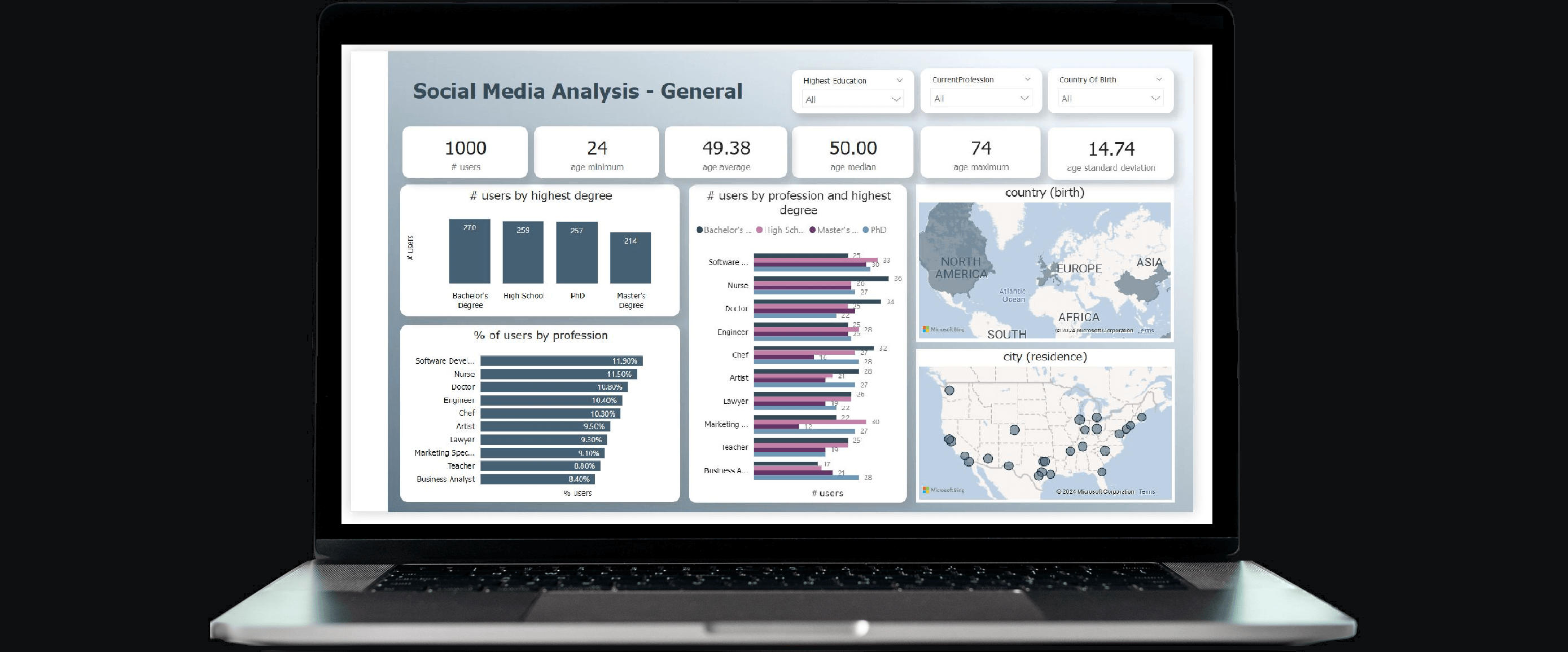
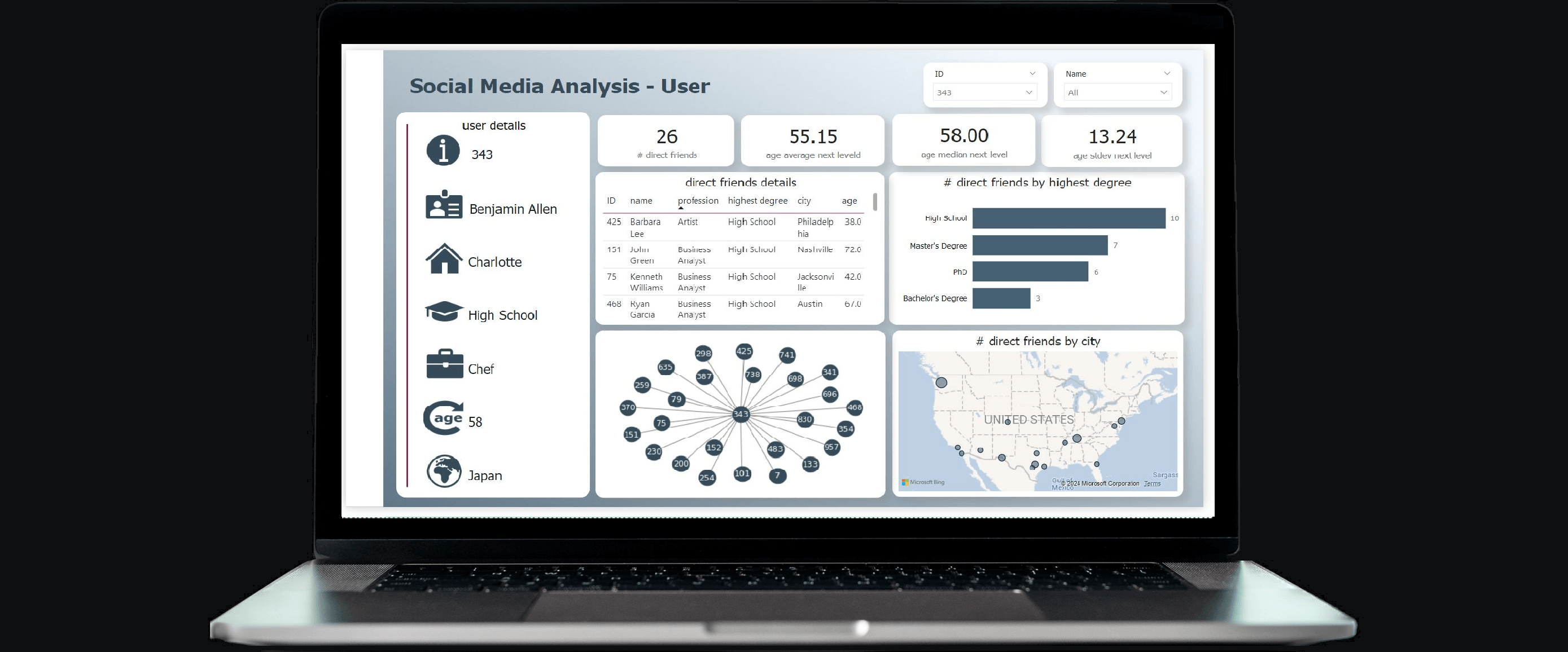
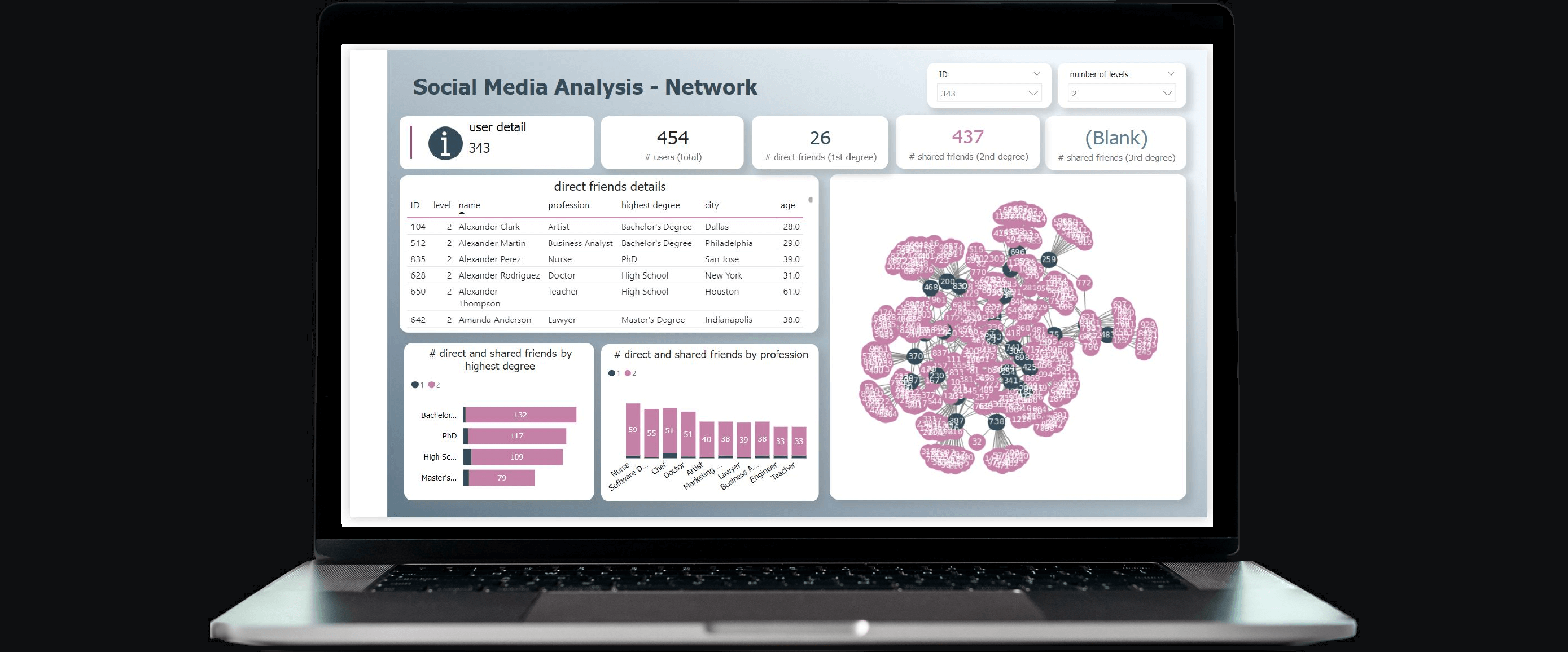
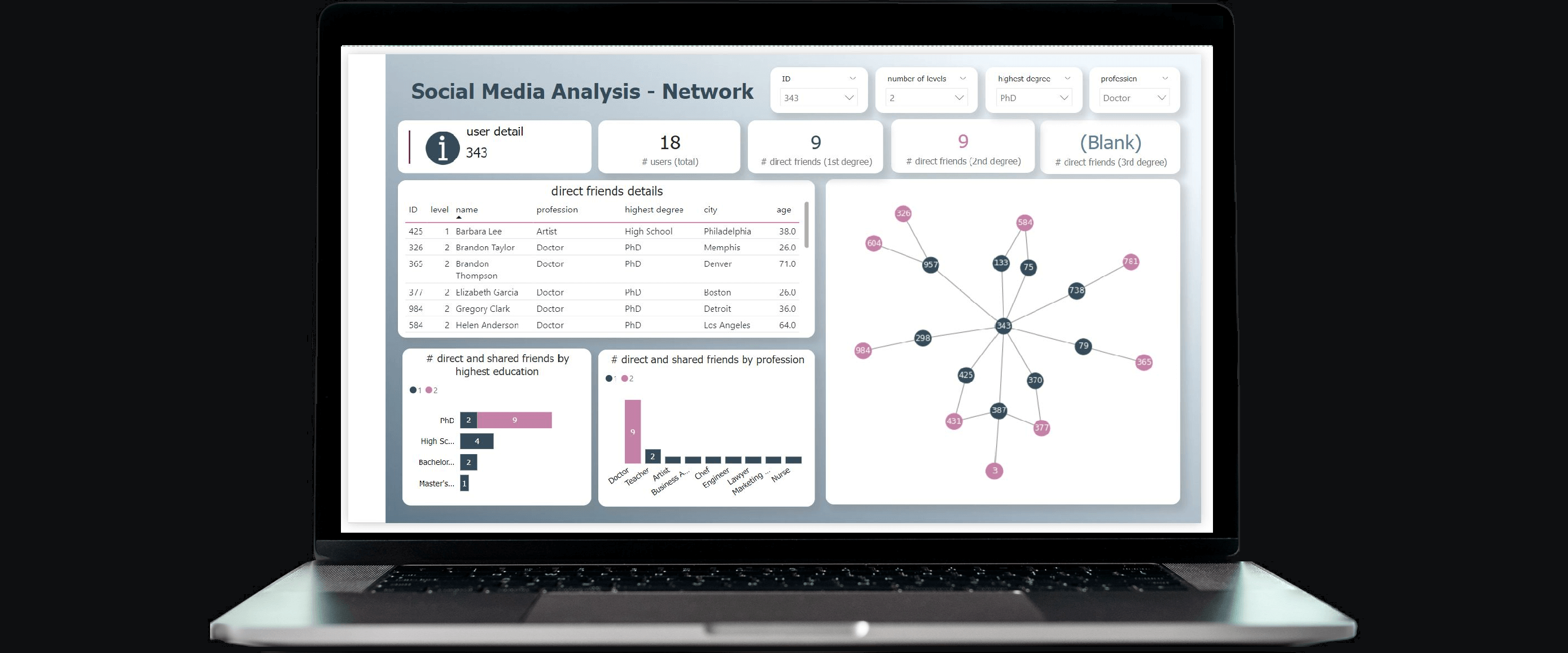
Below an example report. The pages “Social Media – General” and “Social Media – User” are solely built upon the imported tables, whereas the “network” pages additionally utilise graph calculations served from KQL via Direct Query. As a side note, the first Network page below clearly demonstrates the analytical challenges when visualising too much graph data. Finally, the slicers in the network pages use the parameter columns.
end.
I hope this blog article has provided you with some inspiration on how one could utilise Power BI, KQL and Direct Query to tackle graph based challenges. Lastly, stay tuned for upcoming posts on writing KQL code, modelling and visual considerations, and more detailed explanations of graphs and their powerful nature. In those future articles, I am trying to use other appropriate use cases like supply chain, logistics or process mining.
appendix.
Here the Python scripts I used to create the mock up data for this Social Media Analysis use case. First the SocialMediaUser table:
And here the code for the SocialMediaUserEdge table: