
how to create summary stats with calculation groups.

introduction.
Calculation groups is a useful tool to decrease the number of measures in a data model. Imagine, you have the measures Quantity, Revenue, Cost and Profit in place, and you’d like to compare them from a year-to-date perspective. Instead of creating four new measures using the DATESYTD() function, you can create one generic calculation group. This group applies the YTD function onto any measure that you want to see from a year-to-date angle. You can even add other time intelligence members to the calculation group, like month-to-date, year-over-year or previous year. As a result, you get plenty of extra analytical capabilities without even creating one additional measure!
Most probably, time intelligence is the standard use case for calculation groups. However, there are other ones, too! For instance, you can use them to switch between different currencies, units, date dimensions, measures or even formats (see this blog post for some inspiration). Essentially, any time you need to do the same thing over and over again, calculation groups might be a clever and elegant solution. This blog post outlines another scenario, namely using calculation groups to create a bunch of summary stats.
prerequisites.
- Visual Studio (incl. tabular model with compatibility level 1500 or higher)
- Power BI or Excel
.
plan of action.
- Set up summary stats calculation group
- Add calculation items
- Examine calculation group in Excel or Power BI
.
1. set up summary stats calculation group.
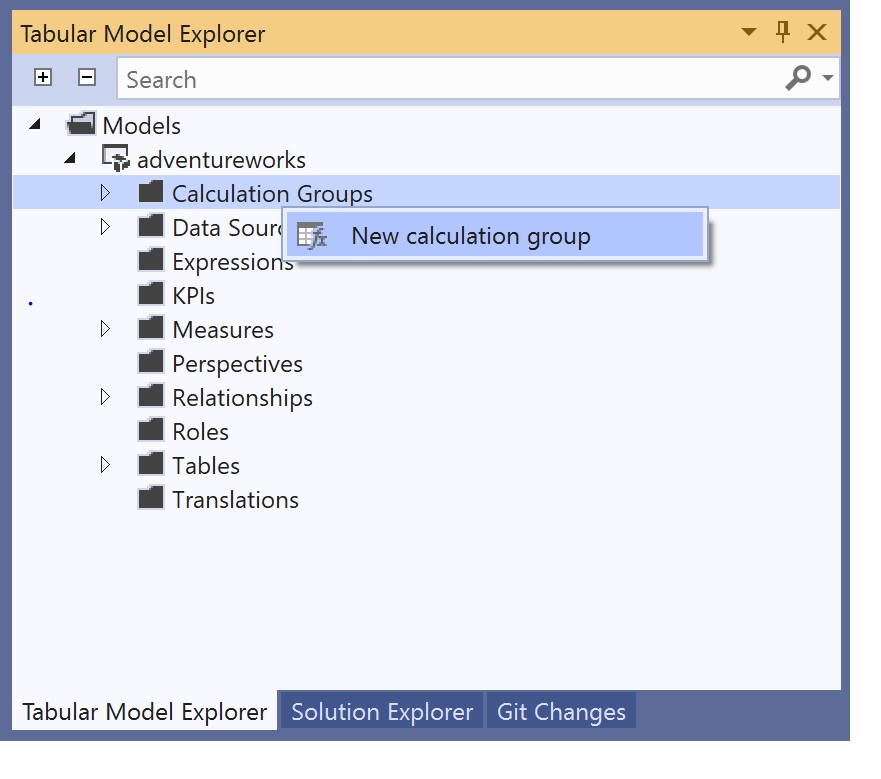
In Tabular Model Explorer, right-click on Calculation Groups and click on New calculation group.
.
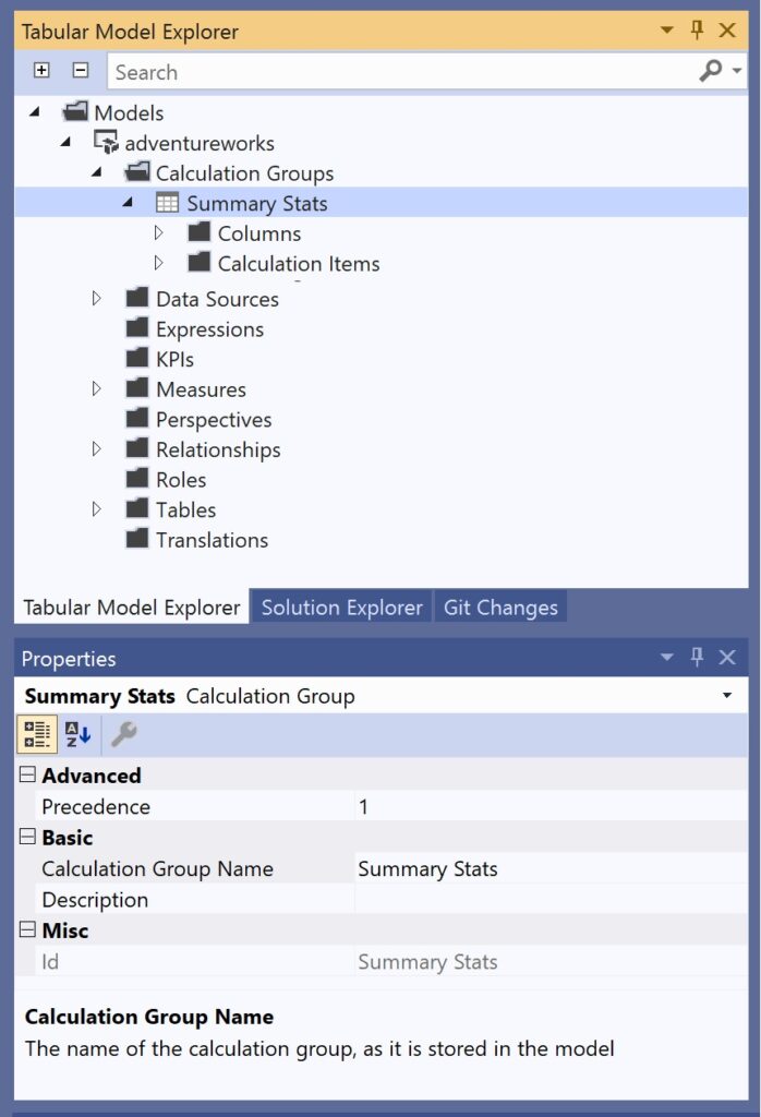
Change the name of the calculation group to Summary Stats.
.
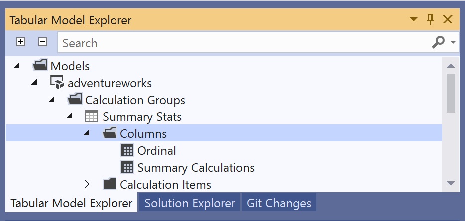
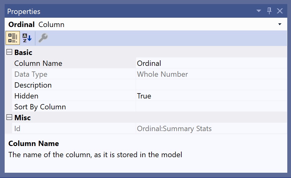
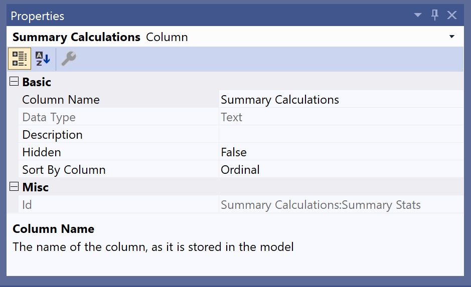
Right-click on Summary Stats and add two columns Ordinal and Summary Calculations with the following Properties:
.
2. add calculation items.
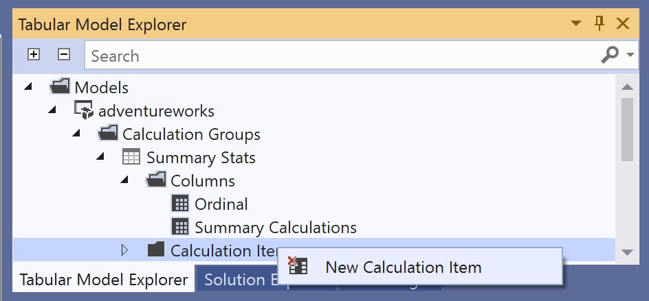
Right-click on Calculation Item and click on New Calculation Item.
.
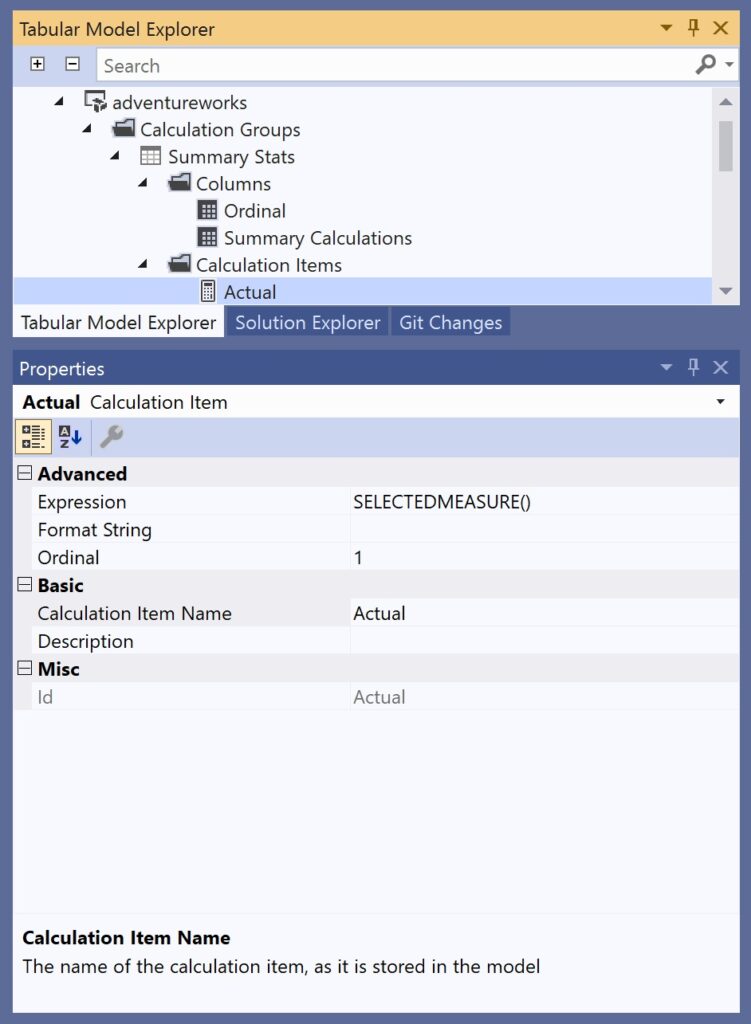
Change the name and set Properties accordingly:
.
Add calculation items with increasing Ordinal number and the following Expressions:
Actual
SELECTEDMEASURE()
AVG
CALCULATE(AVERAGEX([YourTableName], SELECTEDMEASURE()))
STDEV
CALCULATE(STDEVX.S([YourTableName], SELECTEDMEASURE()))
MIN
CALCULATE(MINX([YourTableName], SELECTEDMEASURE()))
PERCLOW
CALCULATE(PERCENTILEX.INC([YourTableName], SELECTEDMEASURE(), 0.25))
MEDIAN
CALCULATE(MEDIANX([YourTableName], SELECTEDMEASURE()))
PERCHIGH
CALCULATE(PERCENTILEX.INC([YourTableName], SELECTEDMEASURE(), 0.75))
MAX
CALCULATE(MAXX([YourTableName], SELECTEDMEASURE()))
SELECTEDMEASURE() is the reference for the measure in use. That is why, we need to use expression functions (MAXX, MINX, AVERAGEX etc.) that first evaluate the measure for each row of a certain table ([YourTableName]) and then apply the summary function. For example, if our measure in use is Profit then the calculation group will first compute the profit for every single row in [YourTableName] and afterwards calculate the average, standard deviation, minimum, median and so on.
.
3. examine calculation group in Excel or Power BI
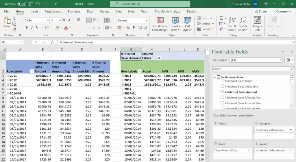
To proof that the calculation group is working as expected, I created a few of these measures the old school way (one new measure per calculation) and did a side by side comparison:
.
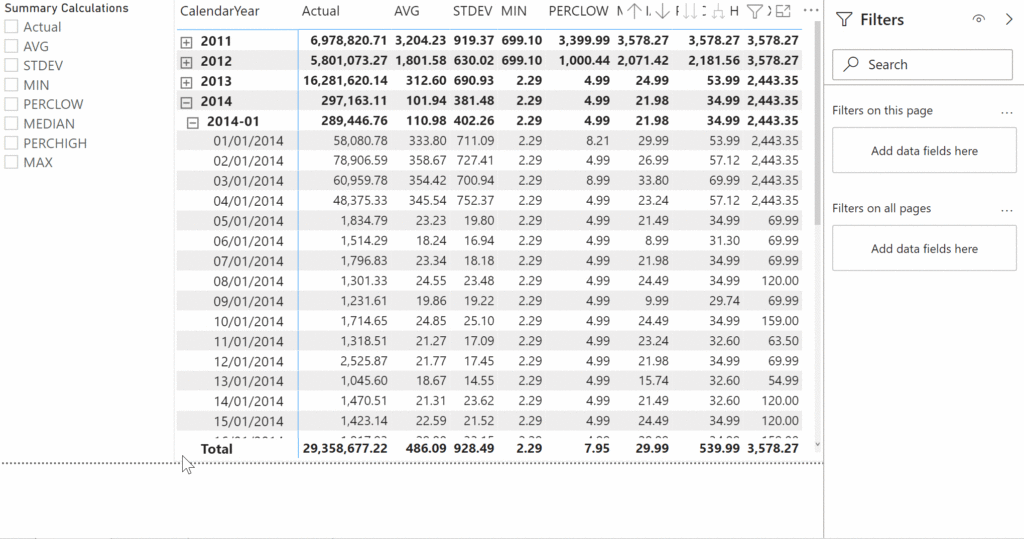
On the left, one measure per calculation (blue) is displayed- On the right, you can see the actual measure combined with the calculation group (green). This screenshot also illustrates that the approaches demand a slightly different way of assembling pivot tables and graphs.
When dragging calculation groups into a visual, by default, all items are displayed. To select only certain calculation members, you can either use a slicer visual or the filters pane.
.
end.
Now, you could even add other statistical members like variance, modus and skewness or you could play around with some more advanced stuff like distributions, statistical testing or regressions. It’s all on you!
Since you have been reading this rather advanced topic about calculation groups, you’d maybe even interested in other Power BI related topics from tackytech.blog. For instance, how to make a service principal the owner of a Power BI dataset or how to debug tabular model directly in Power BI might make your life easier. For common DAX or Power Query patterns, I recommend checking out how to crack the mystery of the mighty DAX and how to swiftly take over Power Query with the help of some useful gear. There is so much to learn about Power BI. And it is anything else but tacky! :P